

Very recently, I was trying to match the wallpaper with the paint color for a project. I had the wallpaper sample with me, took out the shade card, got an exact match, and happily got a liter of it. My idea was to combine this fall leaf kind of wallpaper that was 2/3 the wall with a stucco texture on the bottom 1/3. The idea in my head seemed perfect and I could visualize it so well it was not funny. I sampled it on the wall and waited for it to dry because the paint dries a lot lighter and the color can look off when wet.
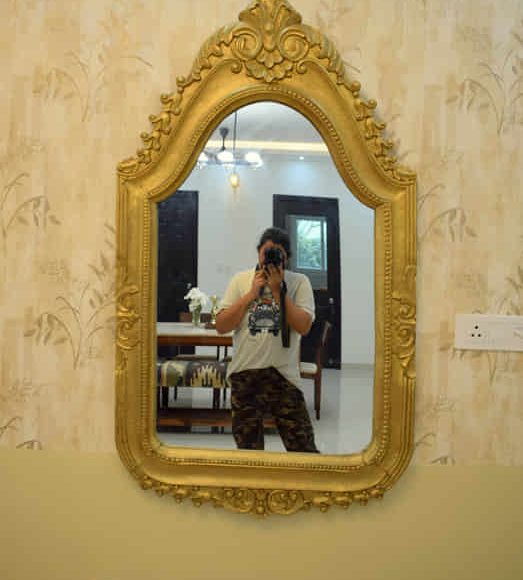
When I returned to it, it looked like a kid with a bad stomach had let it loose all over the wall! It was poop color and the texture was not helping. I was so horrified that I decided to scrap the idea and paint the wall solid in a lighter shade which is what you see in this photo below.
And oh, here is another example of gorgeous wall texture, wrong paint color choice. (I need to recreate this wall in a different color, anyone out there? In Bangalore? I will do it for free… not totally, you may have to feed me, but the wall is free. Get in touch! Dead serious!) Also linking my Youtube video if you want to do it yourself.
Why am I telling you this story?
Well, as a designer, things don’t always go as planned and things look like shit quite literally. So matching colors is something we do all the time and I learn by trial and error. But when I get it right, it’s the chef’s kiss. Have you ever felt like you needed to hug the wall? Please don’t be creeped out, that’s how things are around here.
But when I do hit the jackpot, I think it has to be shared so that you don’t have to go through the pain I do to get here.
So here are 5 paint colors that will pair fantastically well with Indian Decor. All these colors are Asian Paints and this post is not sponsored, its just that it is very easily available for anyone to buy all over the country.
1. Shy Iris 7220
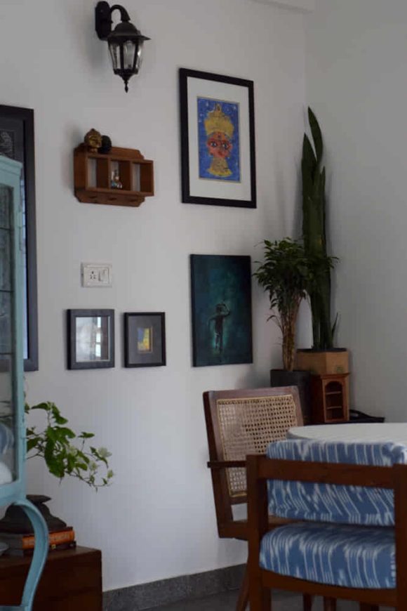
There is no substitute for a good white. And Shy Iris is the perfect one at that. A lot of homeowners are afraid of white walls wondering if it will look like a hospital clinical tone and settle for boring beige instead. If you are one of those, then your prayers are answered and this is “THE WHITE” which I have used in my own home, in clients’ homes, and every single person who has been in the space has said, “oh wow! this is a beautiful white”. I have even managed to convert skeptics with this color. It’s tried and tested and much adored. Just look at the images below!
2. Mustard field X102
This is a lot of yellow being used in the Indian home decor scene, and forgive me for being so brutally honest, a lot of it is the primary color yellow which I don’t use even in my preschool projects. For me, Indian yellow is a more earthy, very mellow yet significant, that has to feel happy and grown up at the same time.
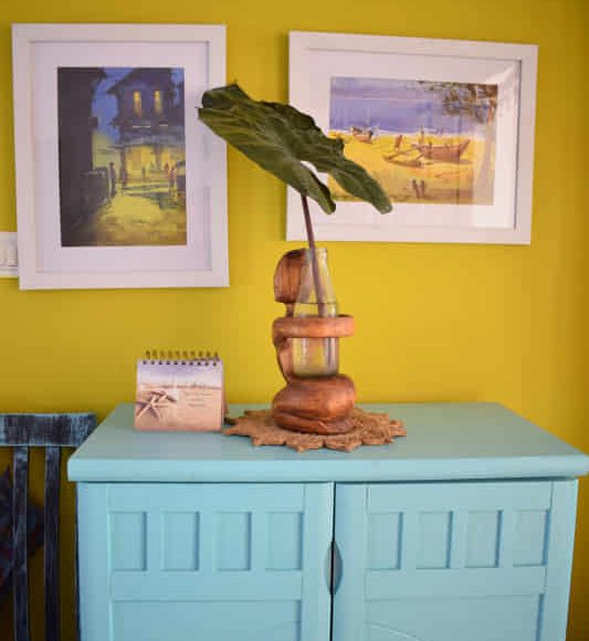
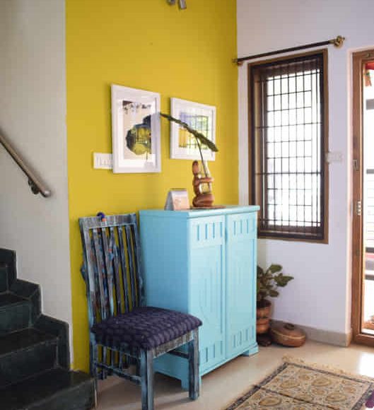
And Mustard Field did that for me. It is this beautiful tone of yellow that pairs so well with all of our teaks and rosewood furniture. It makes the brass and copper pop and it’s just so yummy that you want to scoop some out of the wall and eat it. (sorry! there was no other way of describing that), There is more when the sun shines on it, all your blues will be turned into mustard dreams. (If you know what I mean)
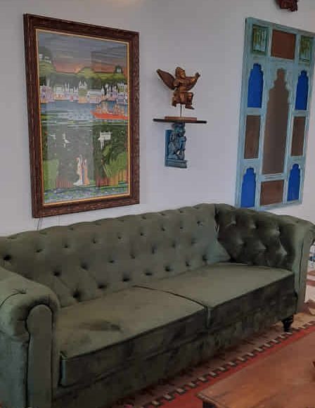
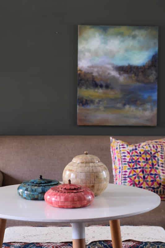
3. Burnished Grey 8327
This is what I currently have on my living room accent wall. I broke the rules and put a dark color in a not so well lit part of the living room and I am so thrilled with the result. Look for yourself.

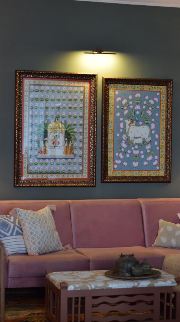
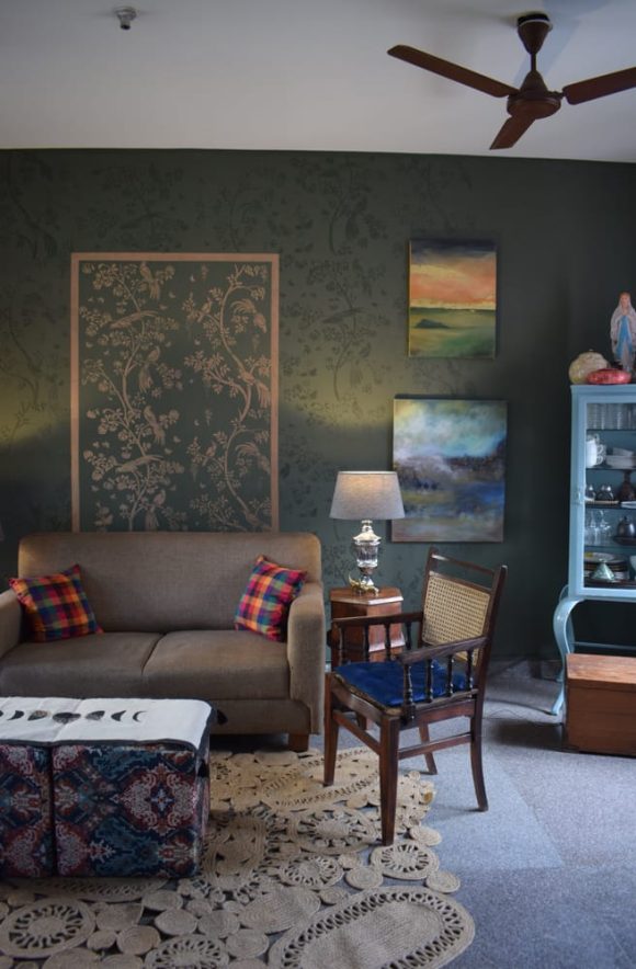
4. Enchanted Forest 8389
Did you think this list would exist without the mention of Enchanted forest? Never! This color is the love of my life! I might just keep it forever in the studio and will never get tired of it. It’s a deep green that is grown-up and sophisticated.
5. Jaipur Dreams 8047
While I am in the pink phase of my life (which I did not have when I was a teen or tween) there needs to be a pink in this list. This is not the typical baby pink. Another one of those grown-up earthy pinks. (Anyone counting how many times I have described the color as a grown-up, yet some other things suggest that I am utterly childish and silly)
I have used this color and quite love the energy of it. I looked for the images and could not find one. Here is an image from the Asian Paints website for your reference. When I do find the image, I will update it here.
Paint is the cheapest way you can transform a room and if you have some DIY bones in your body, it can cost you less than a meal for two in a restaurant. And there are thousands and thousands of paint options out there waiting to be explored. DO you have a paint color that you love? Let me know in the comments.
XOXO
Preethi
Leave a Reply